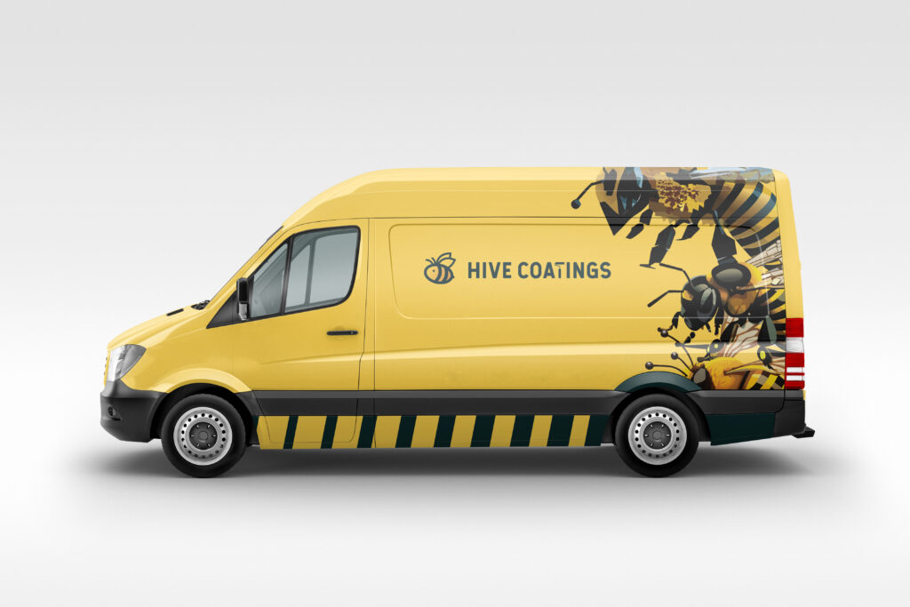
Epoxy flooring branding tends to look either generic or overly aggressive. I wanted to see if I could create something industrial but approachable, local but scalable. Hive Coatings is a speculative brand study I created for my portfolio — an epoxy flooring company based in New Britain, Connecticut.
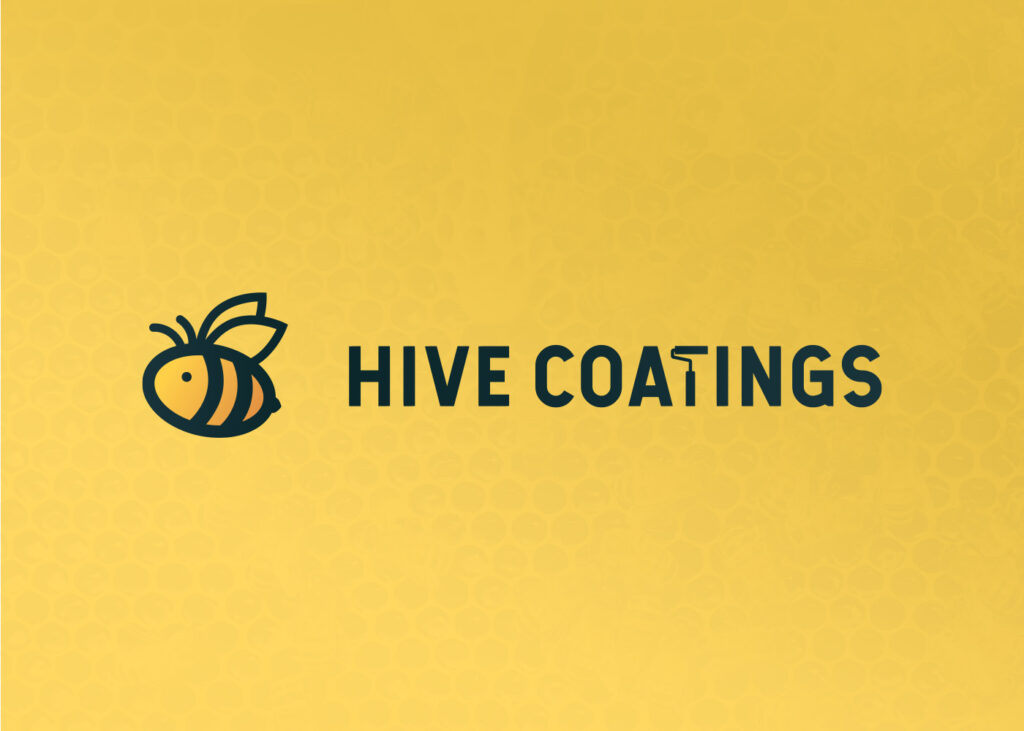
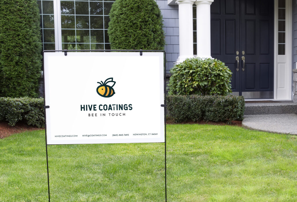
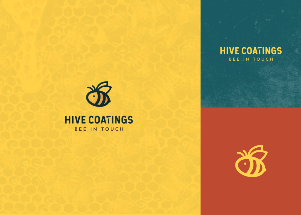
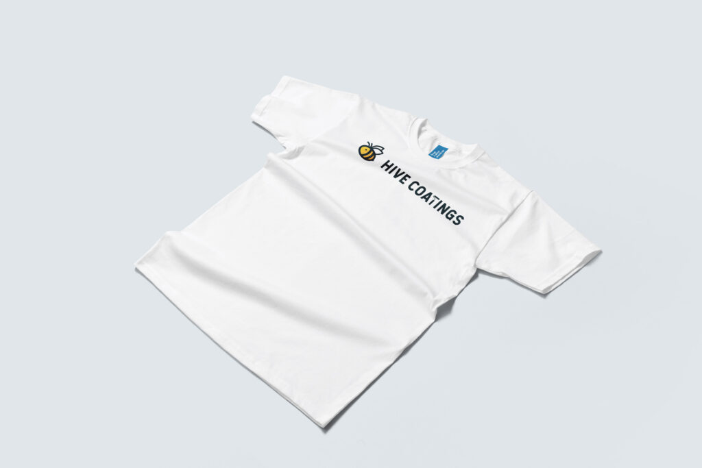
Project: Full logo and visual identity system including primary logo, vertical stack, icon only, wordmark only, and grayscale variations.
Concept: The name “Hive Coatings” draws from New Britain’s city mascot (the bee) and the values associated with bees: hard work, structure, and community. The goal was a brand that felt rooted in its local identity while remaining professional and scalable for a business.
Process
Research & Discovery
I started by researching epoxy flooring competitors to see what colors, fonts, and symbols were common in the space. I also looked into New Britain’s visual identity, specifically its bee iconography, to find a genuine local connection.
From there, I explored words linked to bees — work, colony, hexagon, honey, sting, hive, structure — to uncover possible visual directions. The strongest connections for this industry were structure (hexagons suggest tiles or flooring), hard work (a blue-collar value), and community.
Sketches
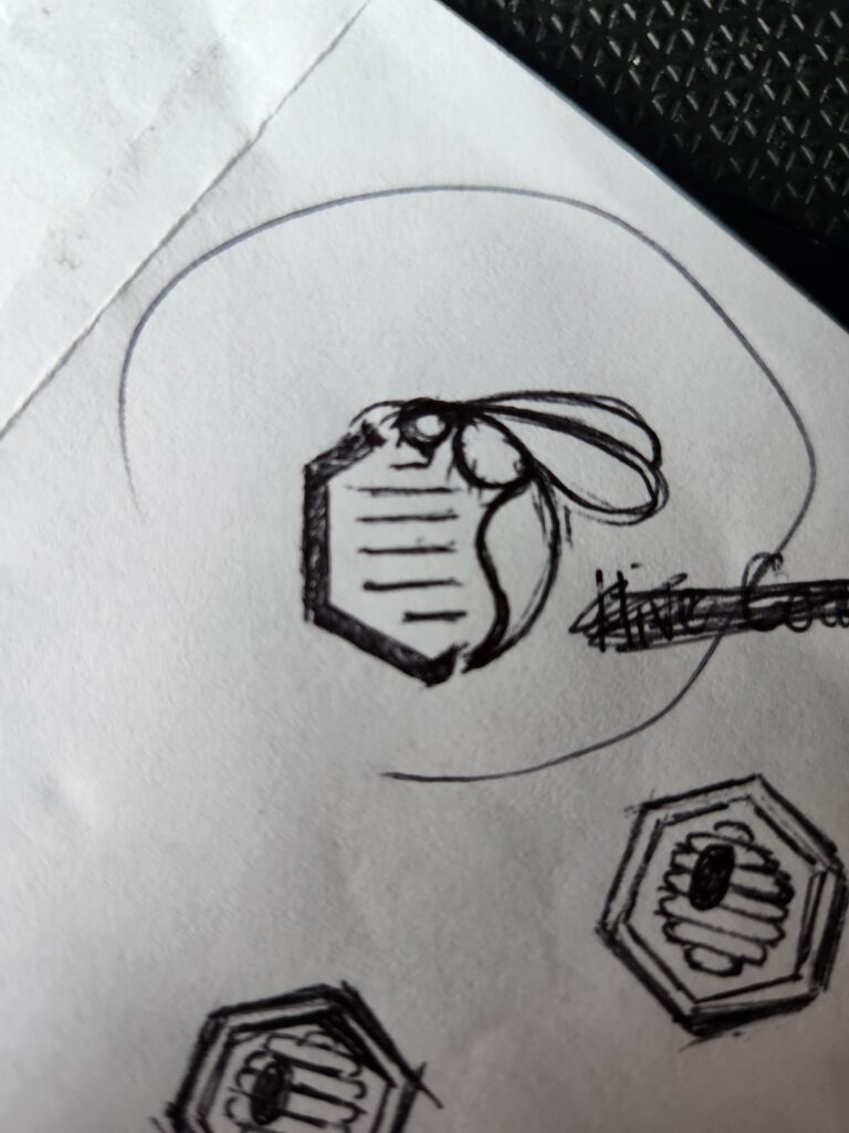
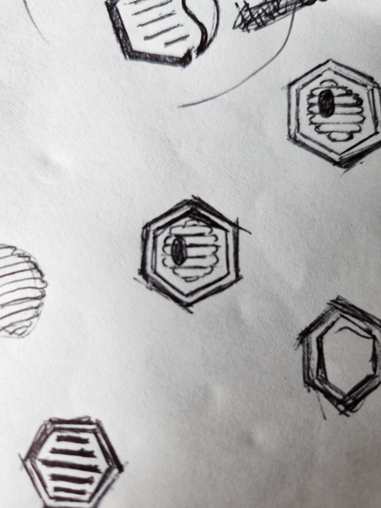
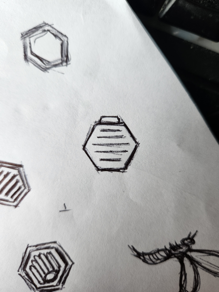
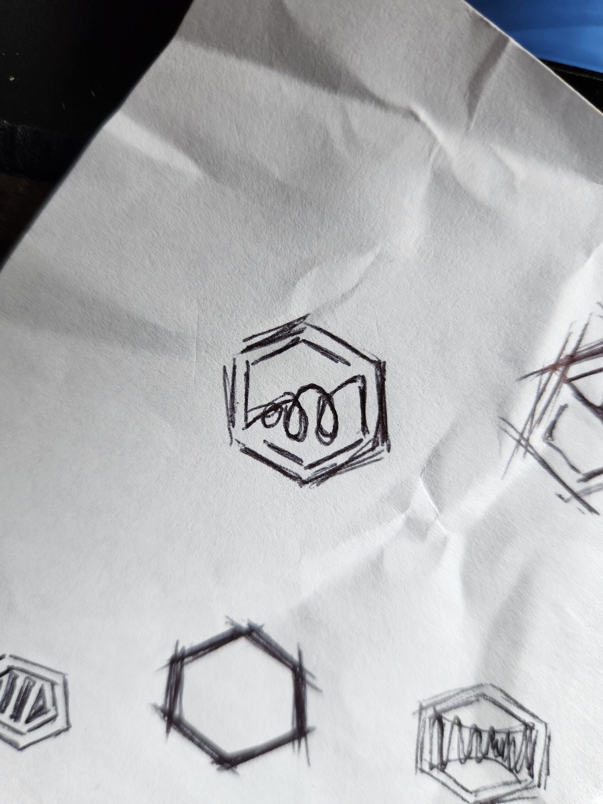
When I sketch, I focus only on the logo mark first — I do not add text until later. For Hive Coatings, I started by exploring combinations of three core shapes: hexagons, bees, and beehives. I drew hexagon frames with bees inside, beehive shapes with hexagonal patterns, and abstract bee silhouettes contained within hexagonal boundaries. The goal was to find a mark that felt structural (for the flooring industry) but still clearly connected to the bee imagery of New Britain.
Digital Concepts
From my sketches, I moved into digital concepts. I created two variations of beehives. One of them used a natural, wasp-like hive shape surrounded by a hexagon frame.
The second was a more geometric, purely hexagonal beehive. I also explored a bee illustration: a simply cartoony styled, simplified bee. These three digital concepts gave me a range of directions to evaluate — from playful to structural, from literal to abstract.
Refinement
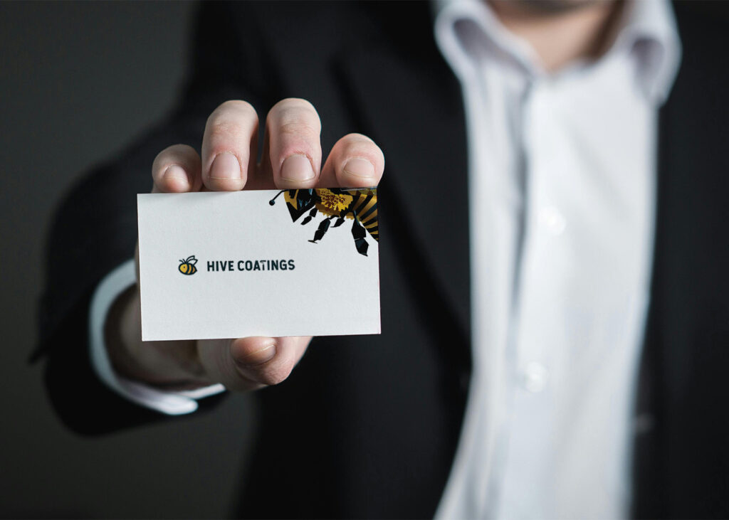
After reviewing the digital concepts, the client picked the simple bee. They liked its very clean, simple aesthetic — easy to recognize and easy to scale. The other two concepts (the hexagonal beehive and the natural beehive surrounded by a hexagon stroke) were set aside in favor of this more straightforward mark.
From there, I moved into refining the chosen direction. I developed the logotype to sit alongside the bee mark and began working on the color palette. As a final detail, I replaced the letter “T” in “Coatings” with a small paint roller icon — a subtle nod to the flooring application that adds personality without distracting from the overall mark. After these refinements, I submitted the final concept to the client for approval.
Closing Notes
This was a self-initiated portfolio project to explore branding for a blue-collar, local business. The name, concept, and all design work are my own.
Created for portfolio purposes.