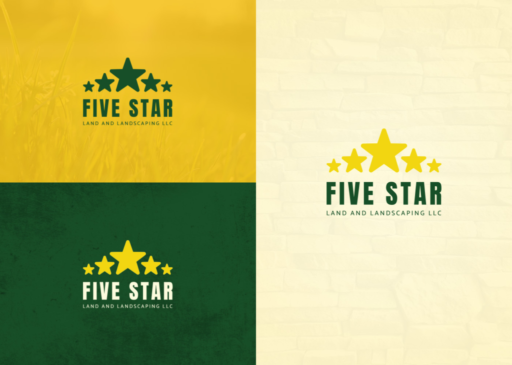
Local landscaping company logos are often bare bones — nothing memorable, nothing distinctive. I saw an opportunity to take an existing Hartford County business and give its identity a professional refresh. This was a self-initiated redesign, not a client contract.
Project: Logo rebrand for a local Hartford County landscaping company.
Concept: The original logo had good bones but suffered from dated gradients and poor proportions. I wanted to modernize it while keeping the star motif, the green and yellow palette, and the local character.
The Process
Research & Discovery
I started by looking at other landscaping companies in the area. What I found was consistent: most logos were bare bones, with little thought given to typography, color harmony, or scalability. They blended together.
That is something that confirmed my instinct. A cleaner, more confident logo could help this company stand out without feeling out of place in the industry.
Sketches
The nature of a refresh meant my sketches were more restricted than a from-scratch project. I was not exploring wildly different directions.
Entirety of the work was focused on fixing the alignment, visual hierarchy, balance, and visibility of the logo.
Digital Concepts
From the sketches, I selected the directions that most closely resembled the original logo while incorporating the most needed changes.
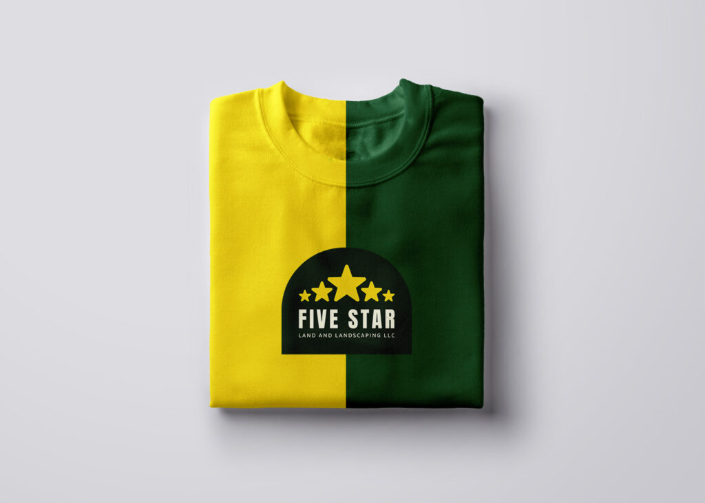
The primary focus was removing the dated gradients that made the original logo feel busy and difficult to print cleanly. I replaced them with flat, solid colors for a sharper, more professional look.


Refinement
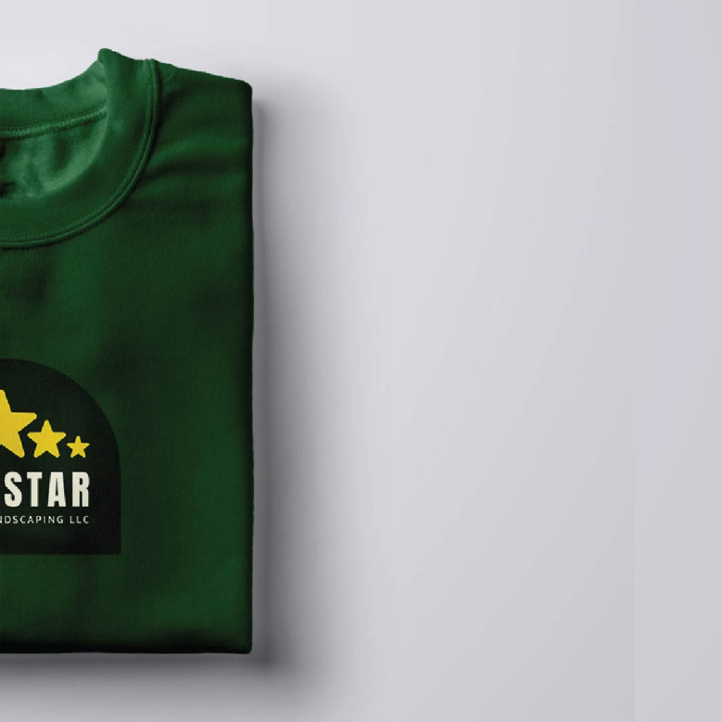
The refinement phase focused on small but critical adjustments. Things such as color ratios, relative size, and spacing.
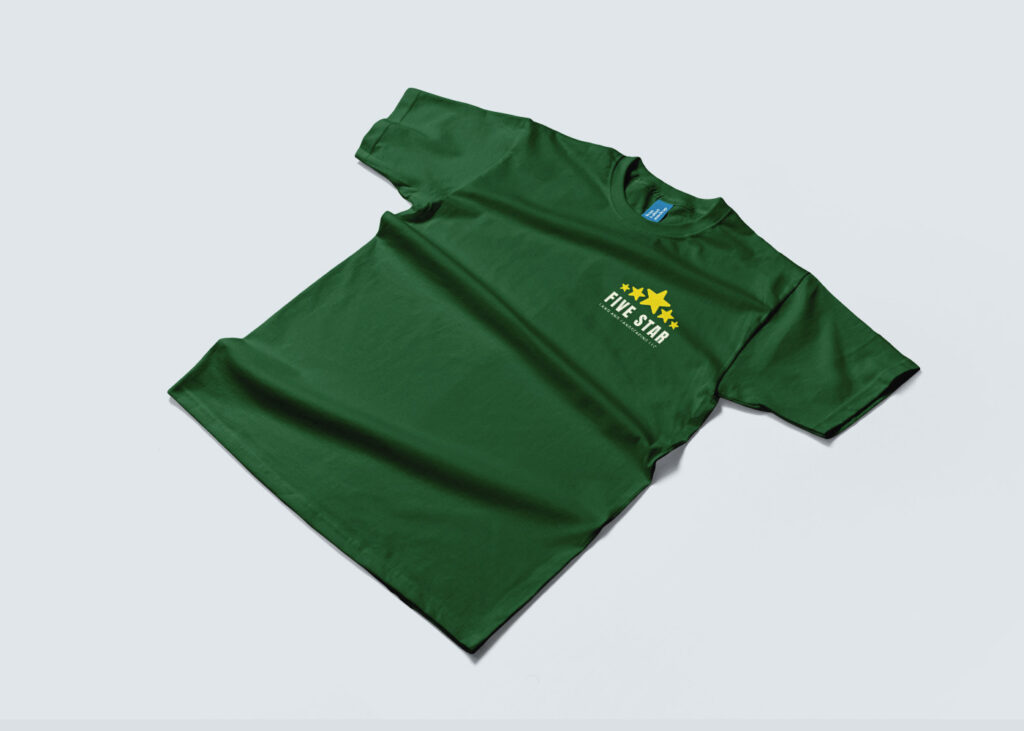
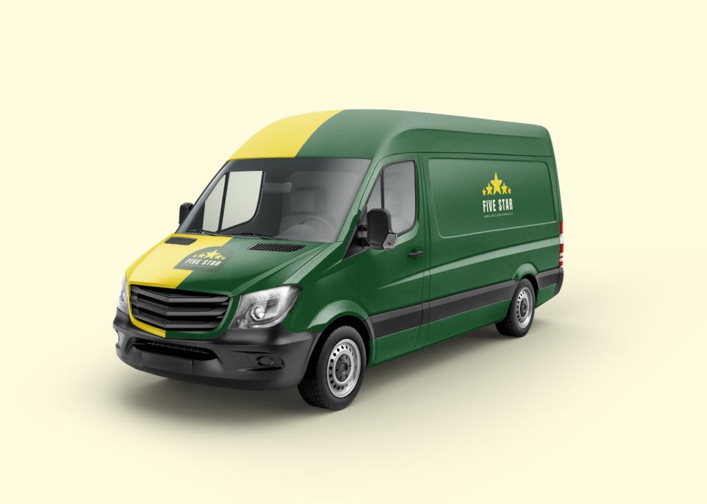
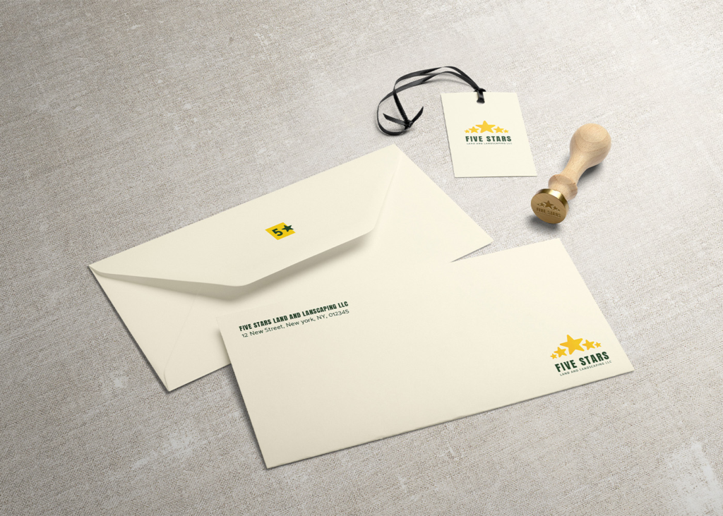
These adjustments were tested on printed mockups at small and large scales to ensure the logo would work on everything from a business card to a truck door. Once the proportions felt right, I locked in the final layout.
Closing Notes
This was a self-initiated redesign for a local Hartford County business.
The original logo had potential but needed a refresh. The goal was never to erase what came before, but to build on it. Cleaner, sharper, and more confident.
Created for portfolio purposes. Not affiliated with or commissioned by the original business.